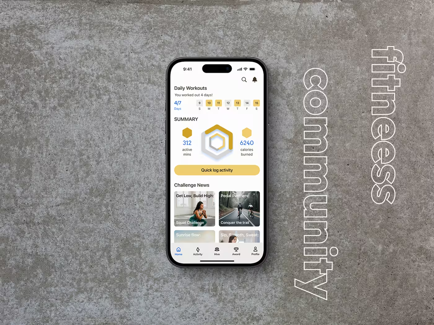
LIFESTYLE
EDUCATION
Project
SavR
Improving cooking confidence through clarity, timing and hands-free guidance
Designing UX for Real-Life Cooking
SavR is a cooking app that offers step-by-step recipes and community support. While feature-rich, users found it frustrating to use in real kitchen scenarios—particularly around preparation, pacing, and interaction during cooking.
In this independent UX design sprint, I worked over five days to reimagine the experience for home chefs, focusing on clarity, structure, and hands-free interaction.

Guided by early research, I framed four key design questions to lead ideation:
help users prep all tools and ingredients before starting cooking?
present cooking steps in a simple, scannable, 1-2-3 format?
introduce new techniques before they're needed in a recipe?
pace instructions to match users' real-time cooking needs?
Uncovering Barriers to Confident, Hands-Free Cooking
Pain Points
- Unclear prep steps or missing tools
- Unfamiliar measurements or techniques
- Needing to touch phone mid-recipe
- Poor instruction pacing

Research Insights
Smart Prep and Calm Layouts Were Industry Standards
To ground the sprint in UX best practices, I analyzed NYT Cooking, SideChef, HelloFresh, and Pandora. These apps prioritized clarity: prep indicators reduced early friction, minimalist layouts supported focus, and voice features—though uncommon—showed strong hands-free potential. Over-cluttered screens consistently slowed users down. These findings shaped a more responsive and cook-friendly direction for SavR.
Users Wanted Control, Not Just Instructions
User feedback revealed that recipe clarity wasn’t enough—control mattered. Beginners felt unprepared without upfront prep, while experienced cooks wanted to skip visuals and move faster. Messy hands made phone interaction frustrating for all. This validated the need for a prep-first design with flexible pacing and hands-free interaction tailored to different confidence levels.
Personalization increased emotional investment
Features like avatar creation and goal-setting helped users feel ownership over their journey, deepening connection and driving continued engagement.
UX Goals for a Gamified Financial App
Clearly communicate app value
Sustain engagementment through progress tracking, personalization, & rewards
Support dual-user needs without overwhelming
Create a first impression that feels fun, trustworthy, & intuitive

Designing Onboarding That Clicks With Kids
I approached onboarding as more than a feature walkthrough—it needed to immediately feel engaging, approachable, and rewarding. My challenge was to distill key financial concepts into an experience that spoke to kids in their language: goals, games, and growth.

What We Designed:
UI Design System
I led the complete visual redesign:
- New color palette combining fintech trust with youth energy
- Typography system for hierarchy and readability
- Mobile-first responsive layout
- Component library handed off to developers for build consistency
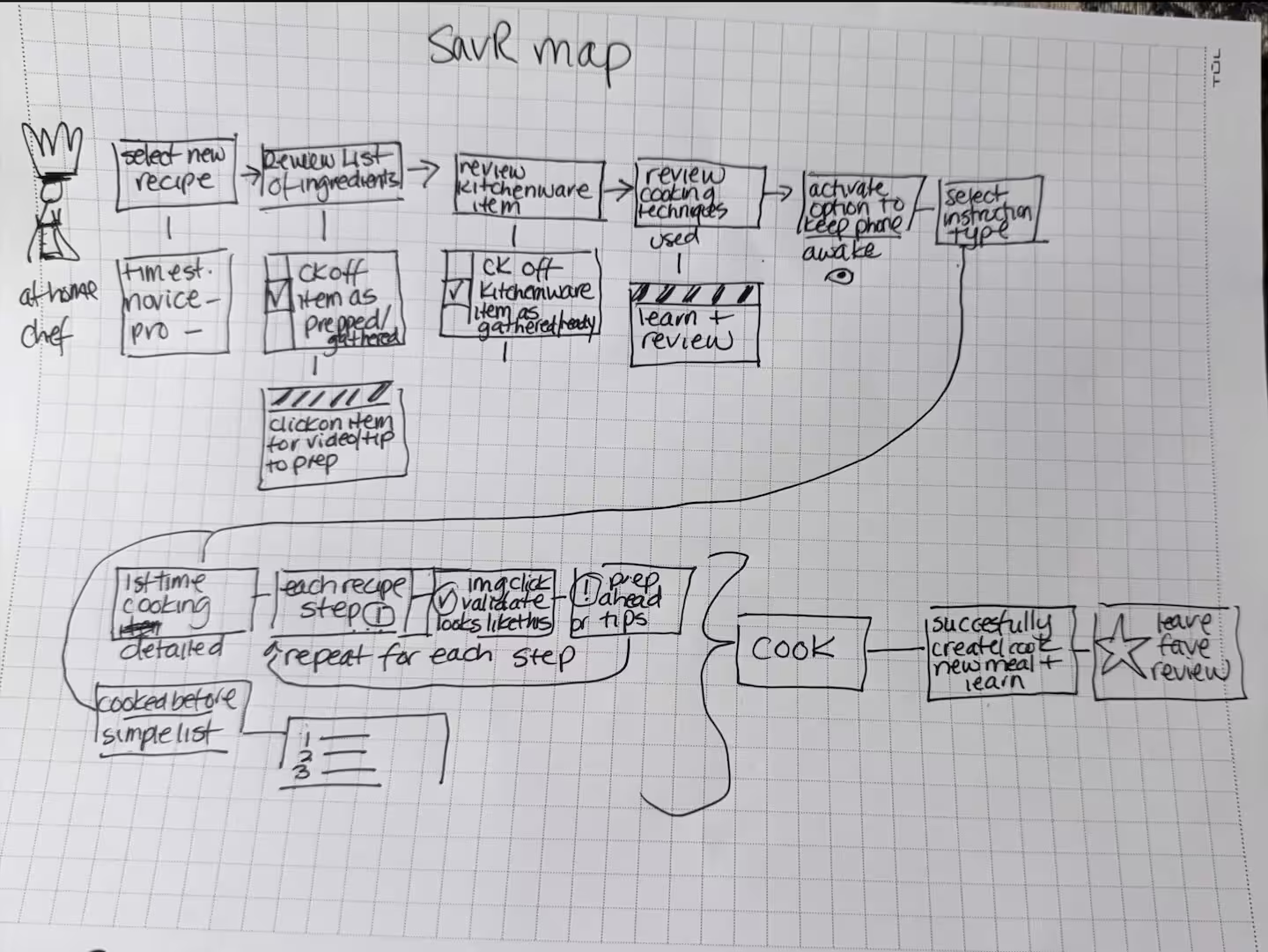
Mapping the End-to-End Journey
Exploring What Good Looks Like
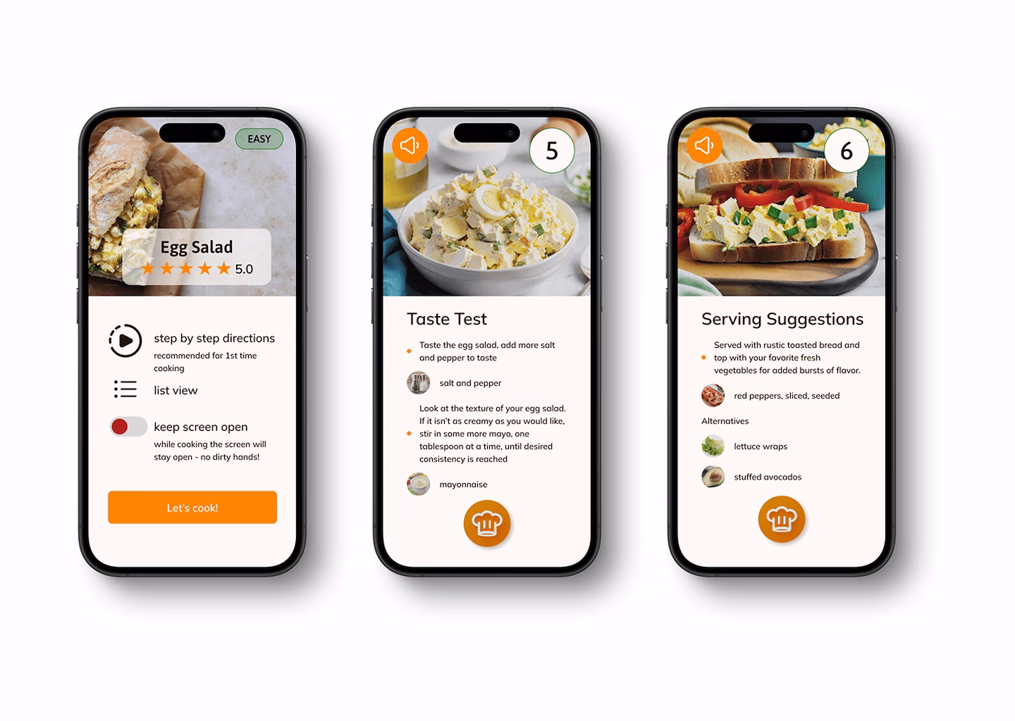
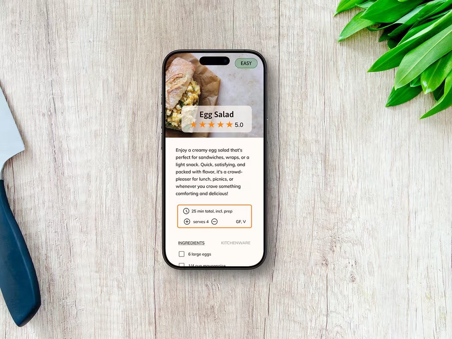
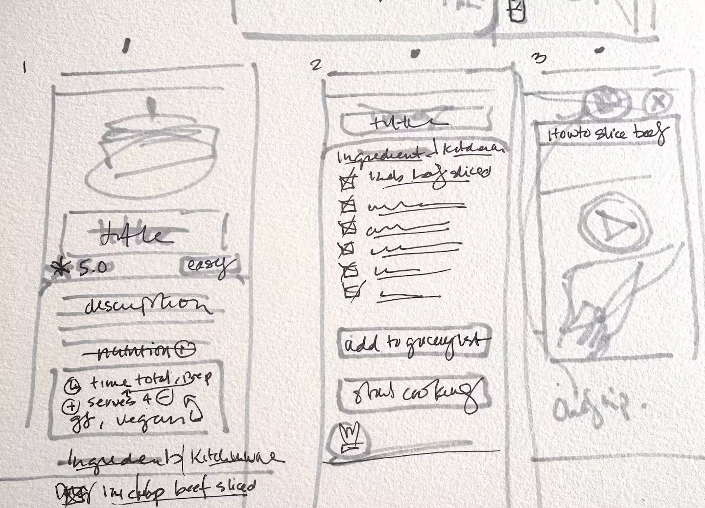
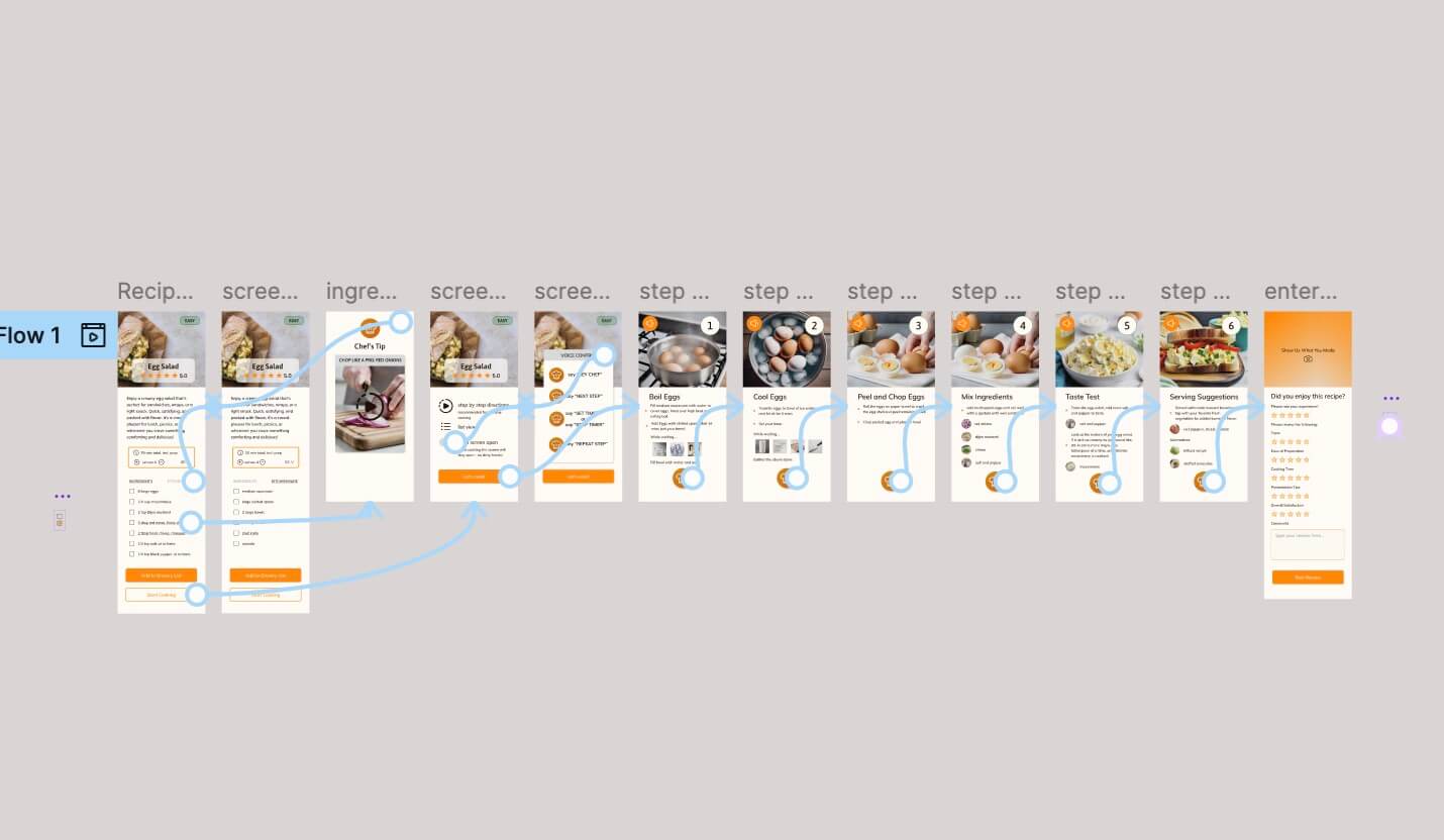
- Clear prep time, tool, and difficulty visibility
- Visual ingredient checklists
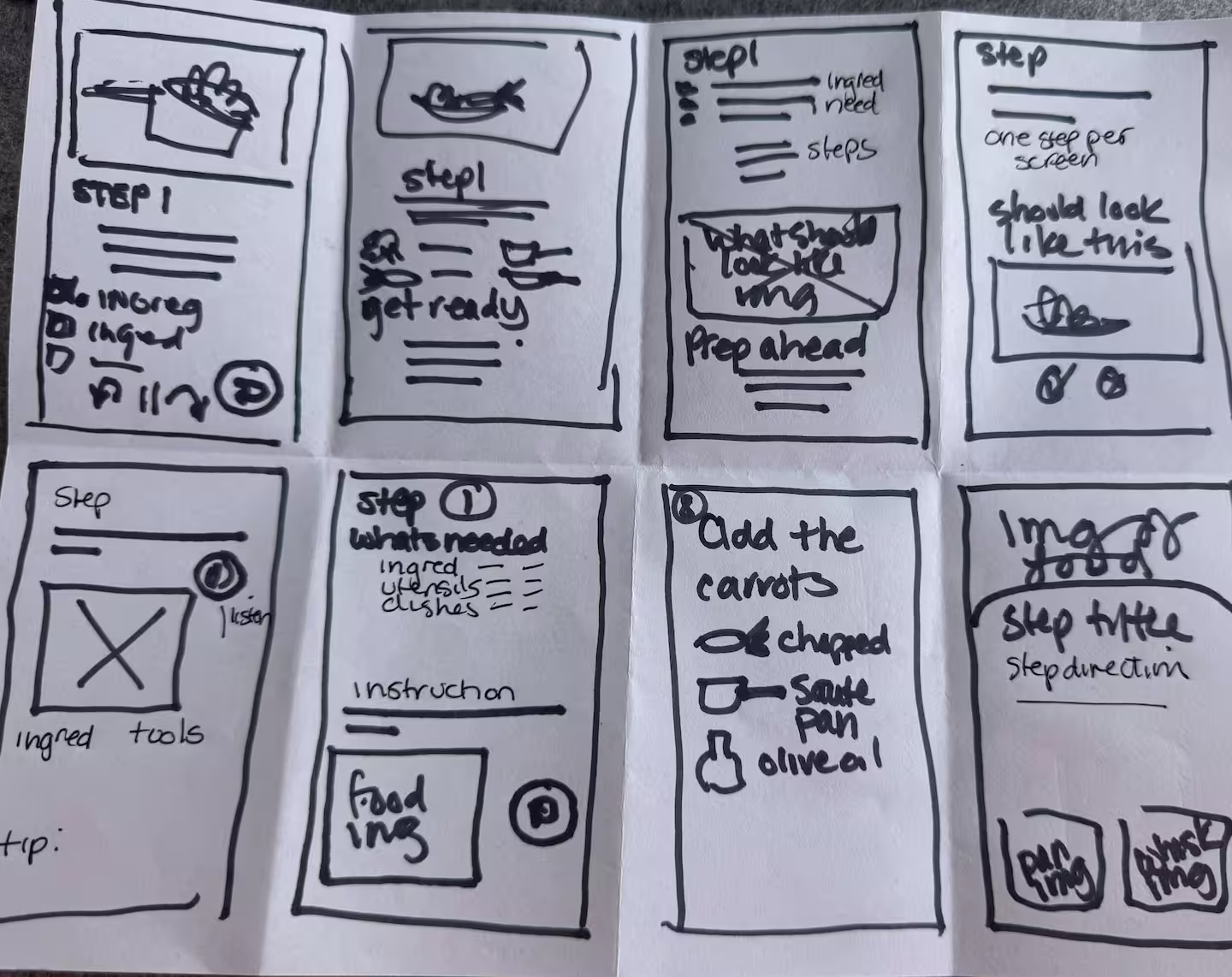
- Step vs. list toggle
- Built-in timers & voice command
- Community wrap-up screen
Defining the Right Experience
- Recipe selection with prep-time and tool indicators
- Prep view with photos and serving size adjuster
- Cooking view with built-in timers, voice control, and progress feedback
- Final tips and light-touch feedback entry
Bringing It to Life
- Hands-free mode for mess-free cooking
- Step/list toggle for flexibility
- Serving adjustments
- Minimalist layout with contextual guidance
- Timers and progress tracking per step
What I Tested
- Beginners said:
- Loved prep visuals & simple pacing
- Found voice prompts reduced stress
- Advanced users said:
- Wanted fewer visuals & faster pacing
- Appreciated the ability to skip ahead or use step-list view
Building a Scalable Design System
- Modular components for onboarding, dashboards, and cards
- Iconography that’s fun but intuitive
- Color palette balance vibrancy & accessibility
- Typography for multi-age readability
- Incorporated Avatar kits to support personalization and character identity

What I Learned
The final design created a calmer, more intuitive cooking flow. By prioritizing voice interaction, flexible visuals, and prep-first planning, SavR became more inclusive for cooks of all skill levels—especially in real-life, time-sensitive moments.
Designing for the kitchen highlighted how essential flexibility is—no single flow fits all cooking styles or confidence levels. Features like voice control and adjustable visuals aren't just nice to have; they make tasks easier in hands-busy, time-sensitive contexts. Working solo within a time-boxed sprint also reinforced how focus and constraints can drive fast, thoughtful UX decisions with lasting impact.
I escalated the issue to stakeholders and suggested redesign to the onboarding flow to defer data collection until consent was granted—ensuring legal compliance, protecting the company, and reinforcing user trust.
This moment reinforced the importance of advocating for ethical, inclusive, and compliant design—especially when working on products for younger audiences.

Legal Discovery
During onboarding design, I identified a company-wide COPPA compliance risk—the app was collecting identifiable data before parental consent. I escalated the issue and redesigned the flow to ensure compliance, protecting both the user and the business.
Final Screens