HEALTHCARE
WELLNESS
Project
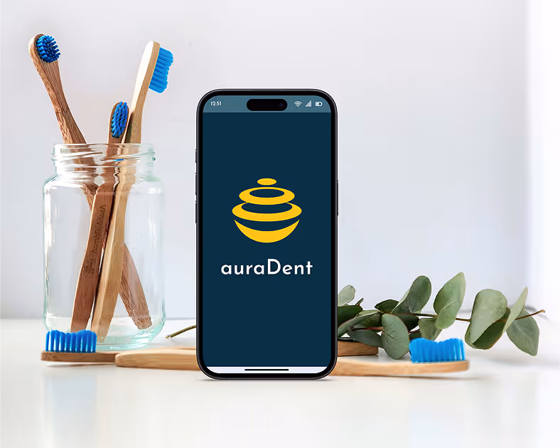
auraDent
Designing for Dental Anxiety with Personalization and Comfort
Designing Calm, Control, and Comfort in the Dental Chair
auraDent is a mobile app designed to support patients who experience dental anxiety. I led the end-to-end design of a solution that empowers users to personalize their dental visits, reduce sensory stress, and feel more in control through thoughtful, immersive UX.
Dental anxiety affects over 36% of the population, leading millions to avoid care and suffer long-term health consequences. As someone with lived experience, I set out to create a product that directly supports this group—reducing fear through comfort, clarity, and empowerment.

help patients with dental anxiety feel informed and emotionally supported before their appointments?
empower patients to feel more in control during their dental visits?
reduce lingering anxiety and reinforce trust after their appointment?
Unseen but Universal: The Silent Impact of Dental Anxiety
Secondary Research
- 36% of people experience dental anxiety
- Twice as common in women
- 9-15% suffers avoid all dental care due to anxiety
- 53 Million in US sufferers of moderate to severe dental anxiety

Interview Insights
Sterile environments intensify fear
Several users described the typical dental office as "cold" and "clinical", which heightened their anxiety before even sitting in the chair.
Waiting rooms trigger dread
The act of waiting—without updates or control—was a major emotional stressor.
Pricing confusion adds to stress
Many users shared frustration over unclear or unexpected costs, which compounded their anxiety.
Designing for Calm, Clarity, and Control
Create a welcoming, calming first impression that reduces anxiety from the first tap
Empower users to personalize their care by expressing comfort preferences easily
Provide clarity and transparency around appointment details, and next steps
Build emotional trust through thoughtful interactions, human-centered visuals, and brand reinforcement

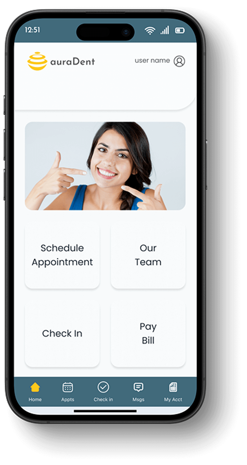
UX Flow That Feels Like Care

What We Designed:
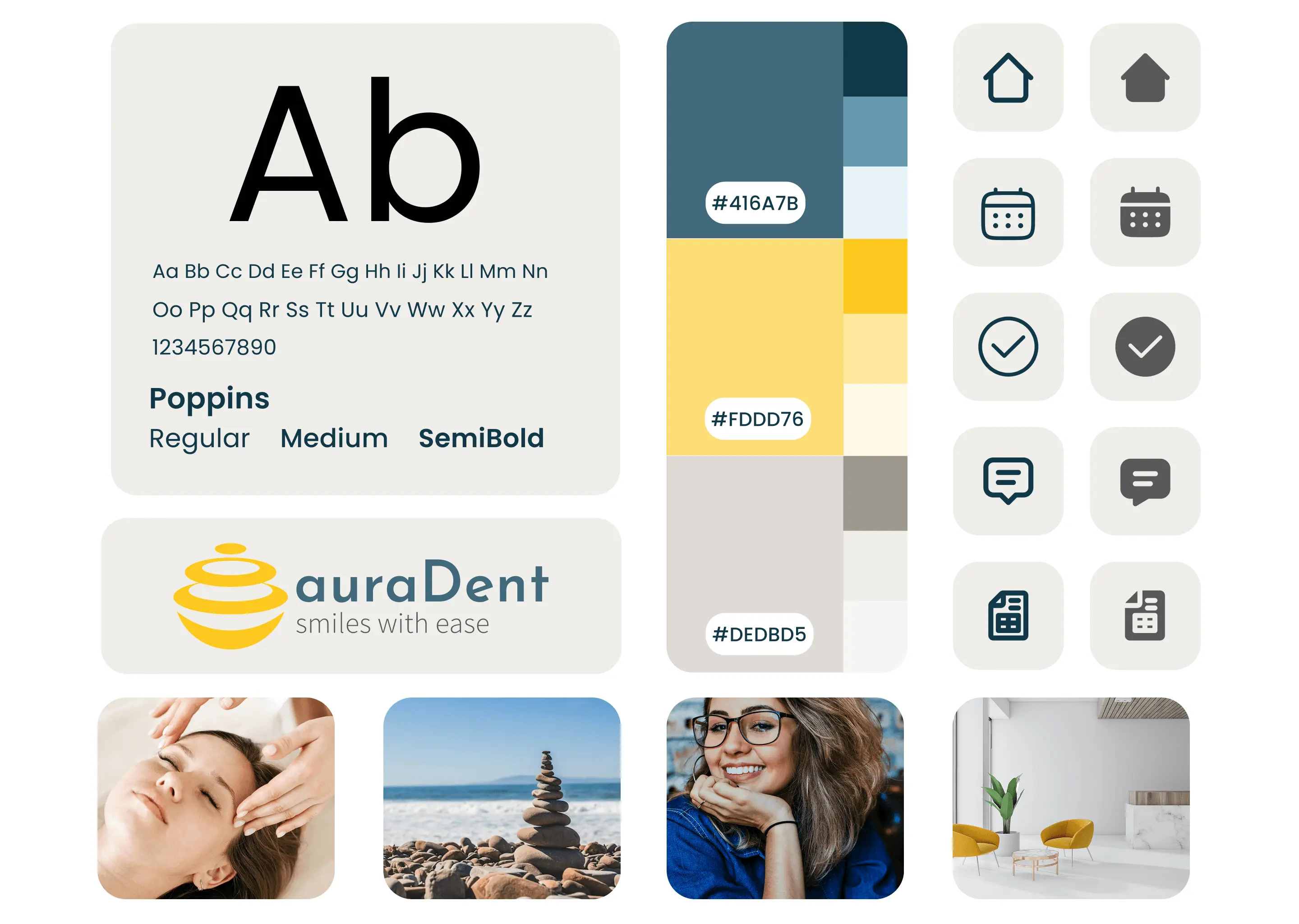
UI Design System
I led the complete visual redesign:
- New color palette combining fintech trust with youth energy
- Typography system for hierarchy and readability
- Mobile-first responsive layout
- Component library handed off to developers for build consistency
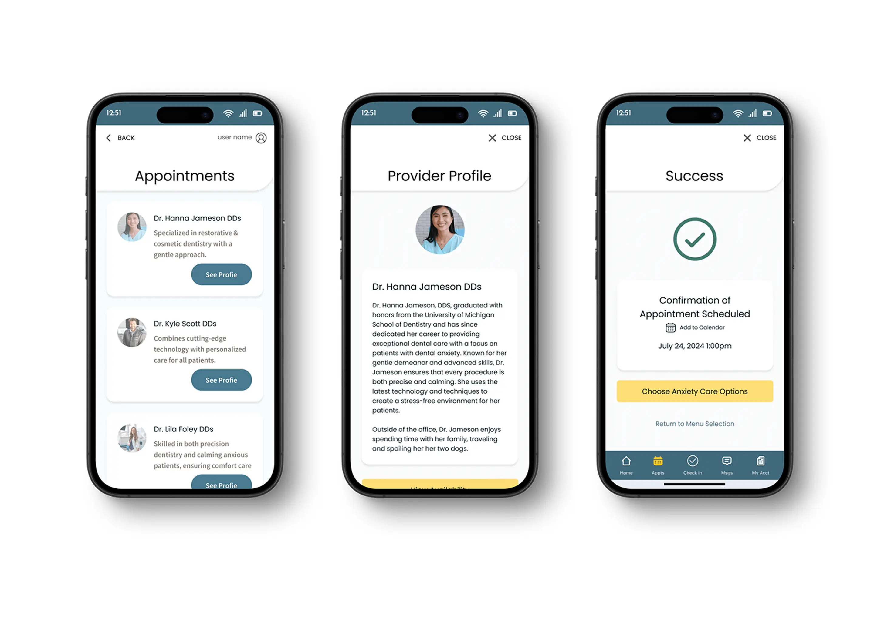
Stress-Free Check In
.png)
Personalized Comfort Options
.avif)
A Dashboard That Calms, Not Overwhelms
Building a Scalable Design System
- Modular components for onboarding, dashboards, and cards
- Iconography that’s fun but intuitive
- Color palette balance vibrancy & accessibility
- Typography for multi-age readability
- Incorporated Avatar kits to support personalization and character identity

What I Learned
This project reaffirmed that design is emotional—especially in healthcare. Small changes, like clearer labels or amore visible check-in button, had outsized effects on user comfort and confidence. I learned the power of micro-iterations to drive meaningful usability gains and how early journey mapping and inclusive testing are essential to creating products that genuinely support vulnerable users. Most importantly, I was reminded that good UX is not just functional—it's deeply human.
AuraDent introduced a fresh, user-centered approach to a largely overlooked problem: dental anxiety. By designing an experience that prioritized emotional comfort and user control, the product filled a gap in the digital health space. Through iterative testing, we improved onboarding clarity, strengthened emotional connection, and reinforced trust through branding and feedback-driven microinteractions. The result was a concept that not only supported users but also offered a scalable, thoughtful model for accessible, anxiety-aware care.
I escalated the issue to stakeholders and suggested redesign to the onboarding flow to defer data collection until consent was granted—ensuring legal compliance, protecting the company, and reinforcing user trust.
This moment reinforced the importance of advocating for ethical, inclusive, and compliant design—especially when working on products for younger audiences.

Legal Discovery
During onboarding design, I identified a company-wide COPPA compliance risk—the app was collecting identifiable data before parental consent. I escalated the issue and redesigned the flow to ensure compliance, protecting both the user and the business.
Final Screens & Prototype