FINTECH
EDUCATION
Project
Flip & Floss
Helping kids and teens develop strong financial habits with engaging technology, gamified experiences, and meaningful education.
Redesigning a Fintech App for Financially Savvy Kids
Flip & Floss is a fintech and edtech platform designed to help families build lifelong money habits together. After launching a starter app to test youth engagement with financial education, the team saw early curiosity, but also rapid user drop-off.
To address this, we were brought in to redesign the mobile onboarding flow and dashboard UX. The updated product needed to deliver fintech-level trust while staying playful and approachable for younger users.

create a first-time experience that instantly captures user’s attention and makes them feel excited to continue?
clearly communicate the app’s purpose and value in a way that feels intuitive, inspiring, and age-appropriate?
sustain a long-term engagement by blending personalization, progress tracking, and playful rewards?
Understanding User Drop-Off
Key Activities:
- Stakeholder Interviews
aligned on goals, product vision & early user feedback - User Behavior Analysis
identified onboarding as the biggest point of friction - Competitive Benchmarking
reviewed apps like Greenlight, GoHenry, & DuoLingo - Persona Refinement
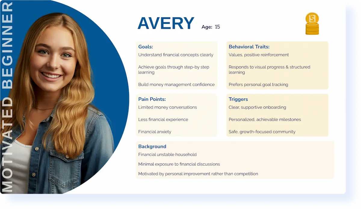
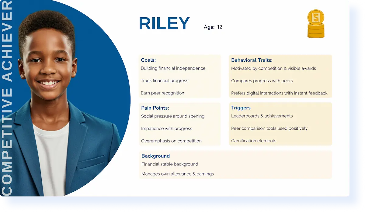
defined our two primary audiences

Research Insights
Onboarding clarity was critical
Users quickly disengage when the app’s purpose wasn’t immediately clear. Opportunity to communicate core value—personalize learning, savings goals from first screen.
Gamification improved engagement
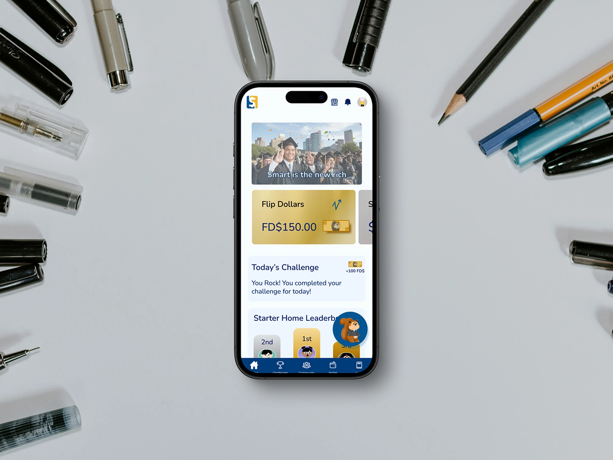
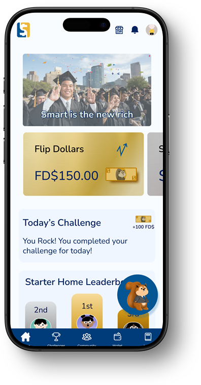
Micro-rewards, achievements, & progress tracking encouraged exploration & give sense of accomplishment, reinforcing positive behaviors.
Personalization increased emotional investment
Features like avatar creation and goal-setting helped users feel ownership over their journey, deepening connection and driving continued engagement.
UX Goals for a Gamified Financial App
Clearly communicate app value
Sustain engagementment through progress tracking, personalization, & rewards
Support dual-user needs without overwhelming
Create a first impression that feels fun, trustworthy, & intuitive

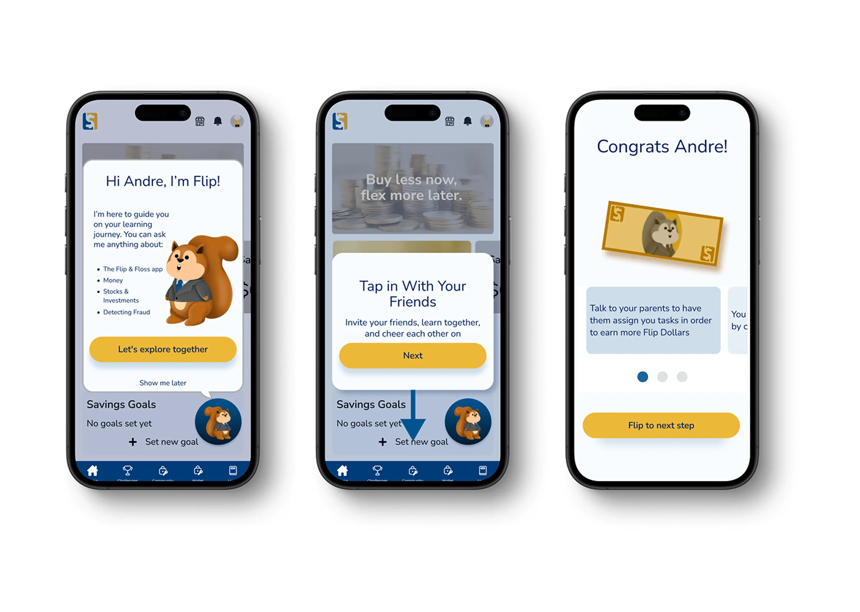
Designing Onboarding That Clicks With Kids
I approached onboarding as more than a feature walkthrough—it needed to immediately feel engaging, approachable, and rewarding. My challenge was to distill key financial concepts into an experience that spoke to kids in their language: goals, games, and growth.

What We Designed:
UI Design System
I led the complete visual redesign in Figma:
- New color palette combining fintech trust with youth energy
- Typography system for hierarchy and readability
- Mobile-first responsive layout
- Component library handed off to developers for build consistency
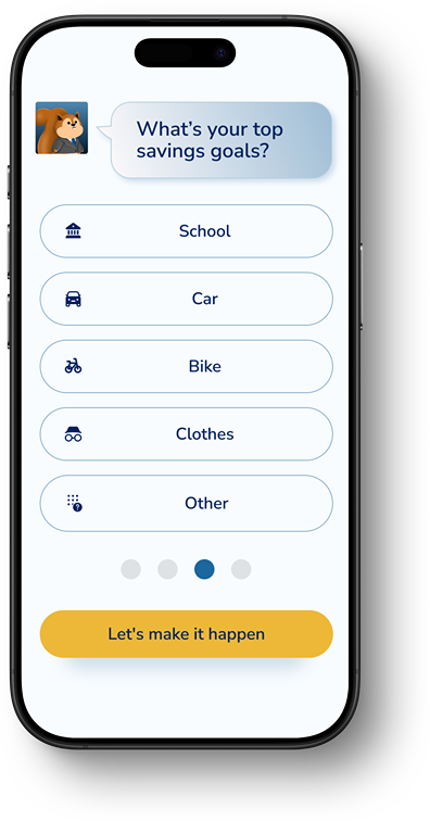
Choosing a Goal That Feels Personal—And Powers FlipAI
Avatar Customization as Emotional Onboarding

Daily Dashboard: A Gamified Snapshot of Progress
Building a Scalable Design System
- Modular components for onboarding, dashboards, and cards
- Iconography that’s fun but intuitive
- Color palette balance vibrancy & accessibility
- Typography for multi-age readability
- Incorporated Avatar kits to support personalization and character identity

What I Learned
Beyond reimagining the onboarding experience and increasing user engagement, this project surfaced a critical learning:
During final handoff, I identified a COPPA compliance risk due: the app was collecting personally identifiable information from underage users before verified parental consent.
I escalated the issue to stakeholders and suggested redesign to the onboarding flow to defer data collection until consent was granted—ensuring legal compliance, protecting the company, and reinforcing user trust.
This moment reinforced the importance of advocating for ethical, inclusive, and compliant design—especially when working on products for younger audiences.

Legal Discovery
During onboarding design, I identified a company-wide COPPA compliance risk—the app was collecting identifiable data before parental consent. I escalated the issue and redesigned the flow to ensure compliance, protecting both the user and the business.
Final Screens & Prototype
.webp)